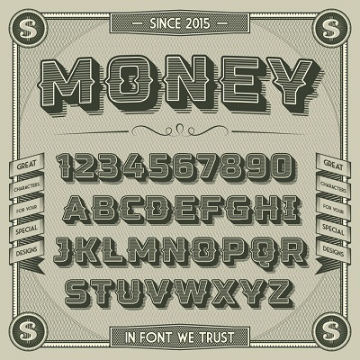
In the past, a web designer could turn to TrueType or MonoType fonts but these fonts are slow loading. Bridge the gap between creative and fast loading by exploring the newest fonts added to the Google Fonts project.
The Google Font Project
The Google Font project is “making the web more beautiful, fast, and open through great typography.” In the past, the project provided only a limited selection of fonts but now offers web designers over 915 fonts. Many of the newest additions are contemporary takes on classic mid-century font styles. They also leverage server compression and caching to increase page speed.
Using new technologies and smaller highly compressed font files may seem contrary to capturing mid-century style. However, there several new fonts that reflect mid-century style in the Google Font library. Designers creating a mid-century look and feel are already familiar with Robot Condensed and Open Sans. They pair them with some of the newest “handwriting” styles from Google Fonts like Parisienne, Sacramento, and Lobster. This creates the look of a mid-century luxury car advertisement. For a bolder, more “Jetsons” feel, some are turning to high impact fonts like Prosto One, Rubik Mono One, Gruppo for titles on landing pages.
Building Your UI Kit
When designing a new website in a mid-century style, start with font selection. Build your UI kit and add elements such as color and images once you have a typeface. With so many new mid-century fonts available, how do you choose the right one for your website design project? The vast public libraries of typefaces can feel overwhelming. If you understand the basics of mid-century design, selecting the correct font set becomes easier.
What Are Mid-Century Fonts?
Mid-century fonts have similar unifying elements:
The appearance of functionality and utility
Serif and san-serif font sets alike sport minimalistic lines
Include botanical and geometric visual references
Originate from 1950s California and Japanese design influences
In pairs, mid-century fonts work best with other contrasting fonts. Web designers often use font combinations, mixing serif with san-serif styles. But which fonts lend themselves to mid-century designs which are “high style” versus “every day”?
Dive deeper into a mid-century design by looking at five key designers, artists, and architects who influenced graphic design and font development. The most notable designers include Edward Wormley, Eero Saarinen, Harry Bertoia, Isamu Noguchi, and Alexander Girard.
Major Influencers of Mid-Century Font Design
Edward Wormley: Famous for exacting designs with minimal line. His expression of the line included layered curvilinear elements with a slightly round bullnose edge. His work is found in many mid-class homes.
Eero Saarinen: Transformed traditional neoclassic styles and adapted them to a clean futuristic statement. His looks are high style and most well know for cantilever edges that seem to flow into one another.
Harry Bertoia: Best known for modified, gentle, and geometric shapes designed in mesh and wire. In Bertoia’s own words, “If you look at these chairs, they are mainly made of air, like sculpture. Space passes right through them.” Bertoia’s designs were very accessible to all levels of society.
Isamu Noguchi: Greatly inspired by traditional Japanese art. Used simple soft biomorphic shapes with minimal ornamentation. Collectors of his work were the most affluent and culturally aware.
Alexander Girard: His minimalist textiles reference Danish and Japanese folk art. Girard’s work marries ornamentation and simplistic lines ane evokes images of family life.
Consider Your Audience in Selecting a Font
If your website design targets blue-collar homeowners, consider mid-century fonts from the advertising section of the Sunday newspaper during the 1950s. These fonts most commonly reference the styles of Edward Wormely and Harry Bertoia.
However, if you are targeting the top 10% income earners, reference fonts from Herman Miller advertisements, which may be more appropriate, or font sets reflecting the sensibilities of Eero Saarinen and Isamu Noguchi.
If your website design should appeal to women remodeling their kitchen, consider fonts that reference the style of Girard.
Once you have decided on your font sets then think about kerning, tracking, and leading as it relates to device and readability. Many fonts seem to choose themselves when viewed on a mobile device.
If selecting a mid-century font still feels overwhelming, it may be time to call an expert. Our web designers know most mid-century fonts by name and can assist you with the style that best fits your website. Our web designers are very familiar with many web font from Google Fonts to Adobe. They also have access to more custom font kits that may contain less well-known fonts likely to make a unique statement.
If you have questions, connect with us today!
