Subscriber Forms can Increase Conversion or Ruin the User Experience
You know the drill. You do an online search on a topic, click on a site that looks good, and start reading about the company. Then about five seconds later, before you’ve had a chance to process what you’re looking at, there it is. A big, square box sliding in from the side of the page, asking you to subscribe to their list. Does anyone ever actually stop and fill out subscriber forms, or are they an annoyance that drive more people away from your site?
What Makes Subscriber Forms Increase Conversion?
Believe it or not, market research proves that pop-ups do increase the number of website visitors who subscribe to your list by as much as 9%! But if they aren’t done properly, you’ll risk annoying your visitors. Search engines may also penalize your rankings.
Here are some better approaches to incorporating pop-up forms that are proven to bring more subscribers, keep your search advantage, and avoid losing potential subscribers before you get started.
Be strategic about where you place the pop up on your page and when it appears
Marketing studies show that pop-ups appearing too soon after a visitor lands on your site results in visitors spending less time there and visiting fewer pages.
Instead of placing your pop-up over top of your content right at the beginning of their visit, consider some better, alternate options:
-
Adding your pop-up at the end of the content instead of at the beginning. This way, your visitors have time to actually read your content and determine if its something that’s of interest. It’s less intrusive and can result in higher conversions than a pop-up that shows up at the top.
-
An exit-triggered pop-up that shows up when the visitor is about to leave the page. It entices them to come back to see what the pop-up is about and increases the chances of converting a visitor to a subscriber.
-
A sticky pop-up that doesn’t cover content but does move with the page as the visitor scrolls through content. It’s unobtrusive but hard to ignore.
Offer something relevant that will entice people to sign up
Everyone loves a freebie. Whether it’s access to expanded content, an e-book, or a coupon, an incentive offer increases the likelihood that someone is going to convert.
Make your subscriber form easy and quick to fill out
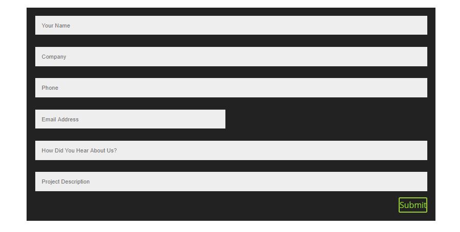
Make sure you make it as simple as possible for a user to subscribe. This means asking, AT MOST, for a name and email address. Nothing more! The harder it is for someone to join your list, the more annoyed they’re likely to get, and the easier it is for them to change their mind.
Make your pop-up form message specific, actionable, and human.
-
Specific – Tell your visitor EXACTLY what they’ll get when they sign up for your list. Let them know you’ll be sending them a weekly newsletter filled with great information that they can’t get anywhere else.
-
Actionable – Write a call to action that goes beyond a simple “click here” directive. Tell them to sign up now to enjoy timely, useful information that’s guaranteed to improve their career search.
-
Human – Subscriber forms that incorporate personality are more likely to garner results. When a visitor to your site feels as though there’s a real person behind the curtain, they’re more likely to invest in a relationship with your product. Try “We’d love to add you to our list so we can send you great information each week.” Avoid basic “Click Here to Subscribe” language.
By following these suggestions, it’s possible to use pop-ups to grow your subscriber list without annoying or driving visitors away. Want more suggestions on best web-design practices? Give us a call or contact us here. We’d love to talk to you further about how to make your website work harder for you.
