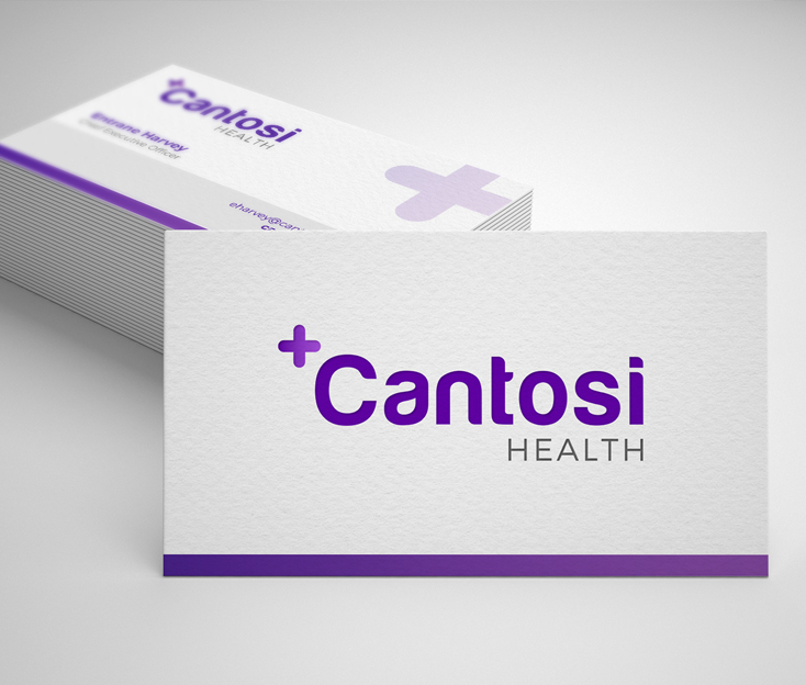
Designing a healthcare brand and logo that stands out from the crowd by choosing a unique color palette.
In a world where consumers shop for healthcare providers every day, it was important for us to build a brand that stands out from the crowd. The healthcare industry relies on blue as the primary color in logo design. In fact, it’s used in 85% of healthcare logos.
However, we wanted to do something different. We decided to use purple for Cantosi’s branding and logo design. Purple gives their logo a more modern, contemporary feel. This considered approach also makes their branded tradeshow booth and marketing materials stand out at crowded healthcare conferences where most other booths are blue.
