There are a lot of reasons to change your logo – and at least as many reasons not to. Some organizations change their logo just for the sake of change, because the new marketing director wants to do something to prove her value, or because a brand redesign firm persuades them that a pricy redesign is in their best interest. These are not the best-thought-out reasons for a change.
If your organization has undergone a significant change, however, or has truly outgrown its logo, then taking a look at an update or new design may be just what your company needs to strengthen its brand. Certainly a new logo makes sense if you’ve had a business acquisition or a merger, or if you’re changing your name or doing another sort of rebrand. If your organization or the marketplace has evolved significantly, an updated logo can send the message of growth and development. It also can be a good idea if your old logo just doesn’t work for you. Perhaps it’s technically problematic, making it difficult to scale to web or new media. Or maybe the logo was designed hastily or with dated-looking fonts, colors, or shapes.
When considering a change, ask yourself and your team some questions.
- What difference would the change make?
- Does the current logo reflect where the company is headed?
- Does the current logo work equally well across all platforms?
- Does the logo you have today connect with customers in the way you want? And are they the customers you want?
- Is your current logo industry-appropriate while at the same time differentiating you from competition?
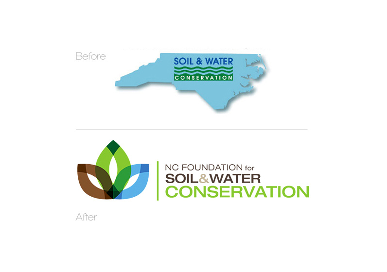
The North Carolina Foundation for Soil and Water Conservation decided they needed a change to their logo. Their old logo was nearly identical to the logo of some organizations that did similar work, and while the groups work together, they are distinct entities. Essentially, the Foundation struggled with having a brand of their own. Creating a new and distinct logo was a key part of establishing that brand.
They turned to Doug Brown Design for a new logo design. The original logo had the words soil and water conservation over a silhouette of the state of North Carolina. It didn’t include the word “Foundation” and didn’t scale well across platforms. The designers worked with the Foundation team on the values they wanted to convey with their brand and created a new logo that incorporates shapes and colors representing water, soil, and plants to represent conservation and the environment. The elongated shape is a more current design and combines with a clean font that draws attention to the name of the organization.
Changing your logo shouldn’t be taken lightly. If your logo is well-recognized and liked, it’s probably best to keep it. However, if your organization is rebranding, evolving, or going through a significant change and your logo is not sending the message you want, it may be time for an update.
